Client
G Camp
industry
Non-profit / NGO
service
Brand Identity + Strategy,Illustration + Worldbuilding,Flex Design
summary
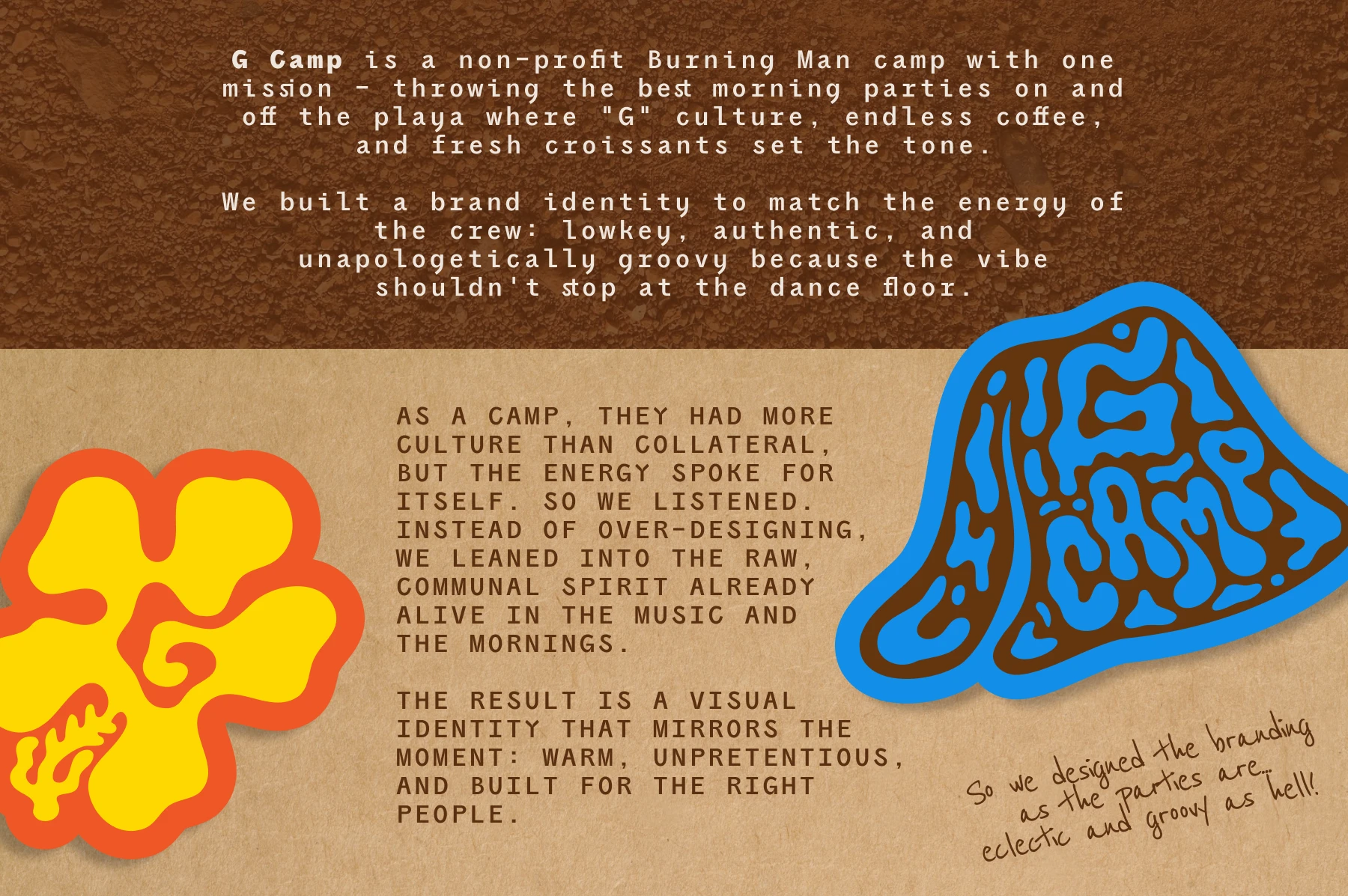
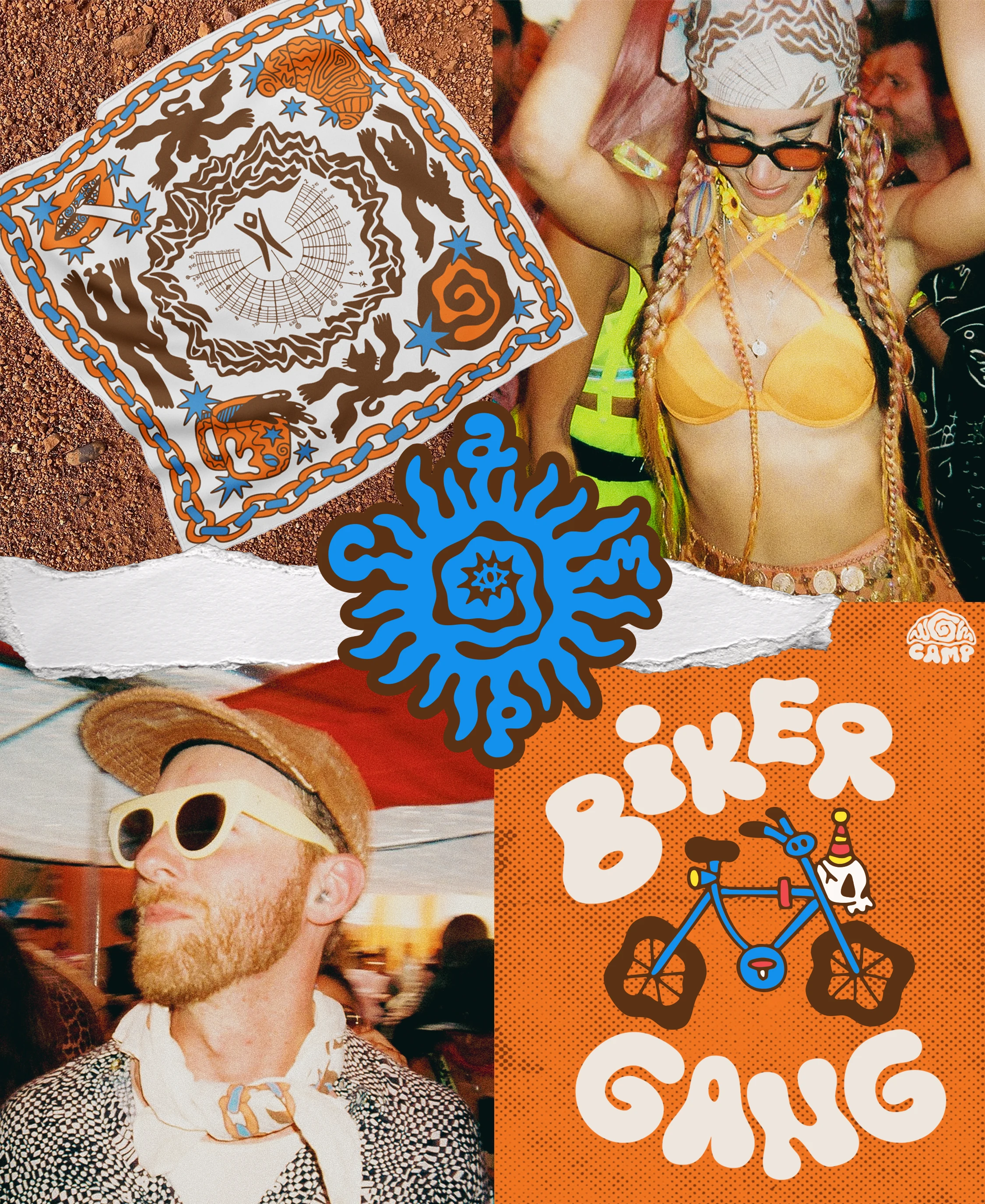
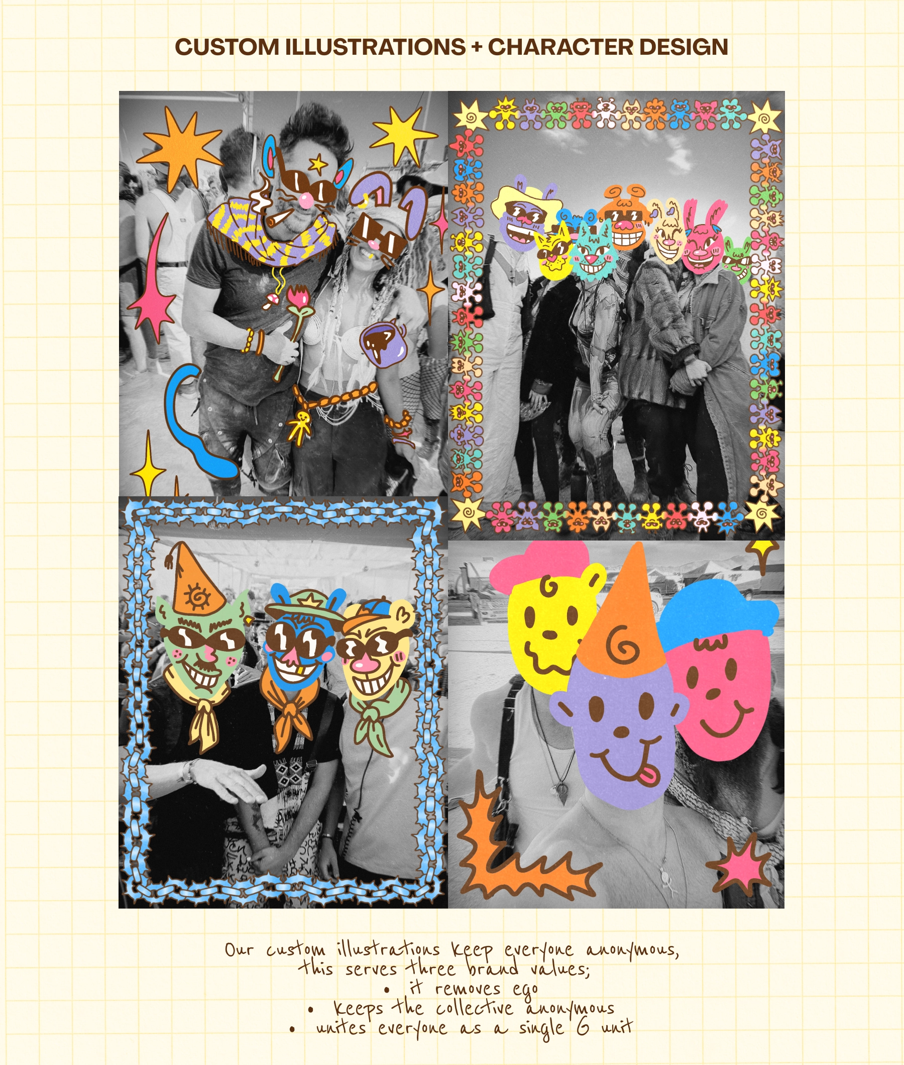
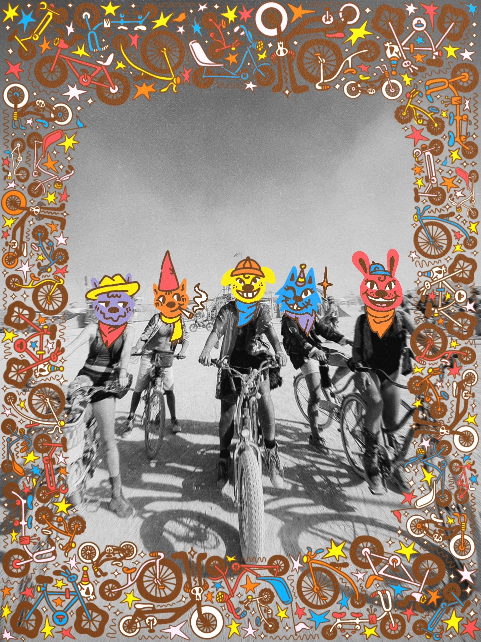
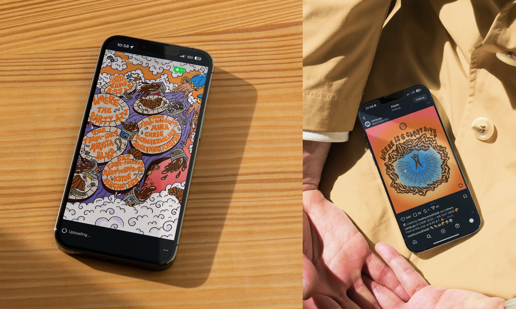
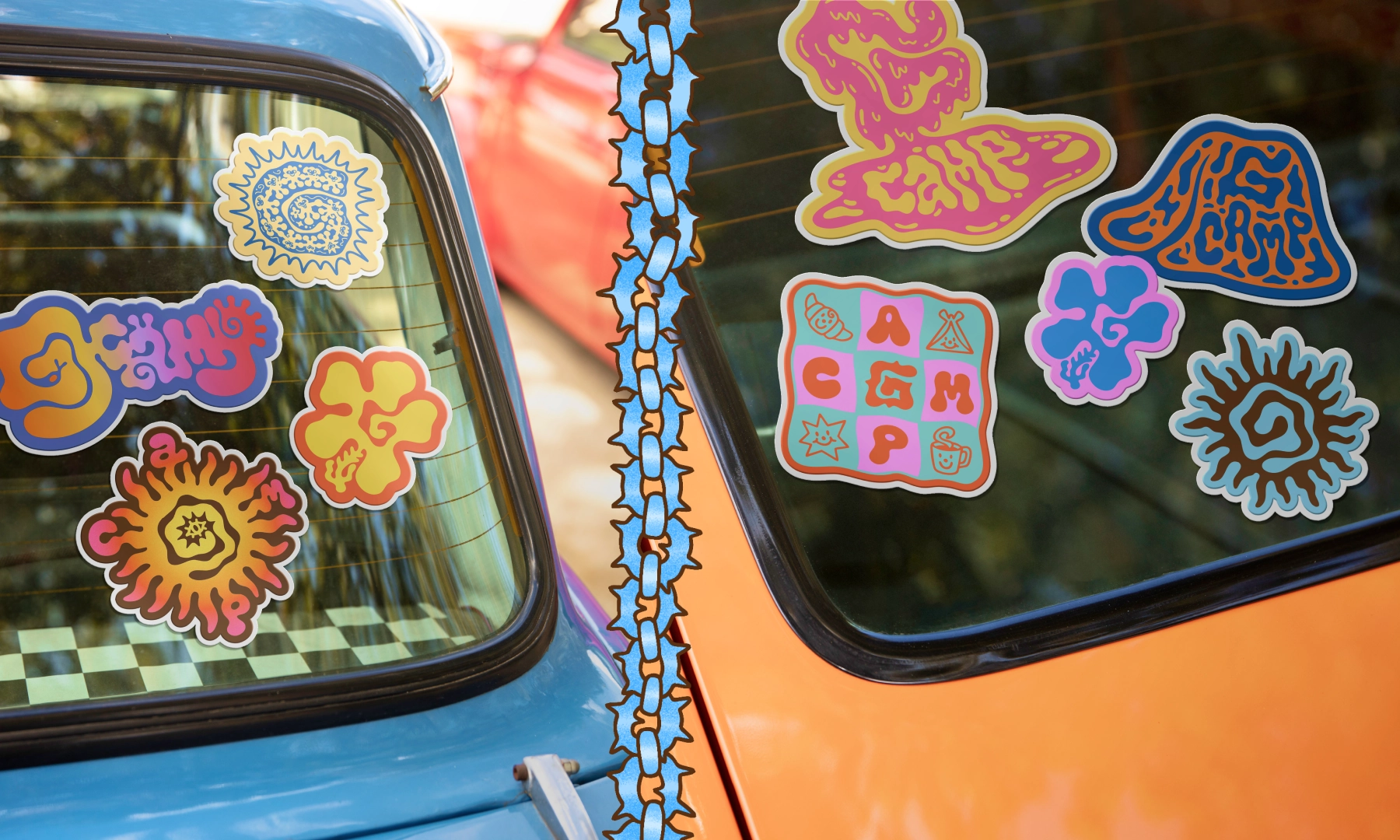
We built a brand identity to match the energy of the crew: lowkey, authentic, and unapologetically groovy because the vibe shouldn't stop at the dance floor
(1. )
about the project
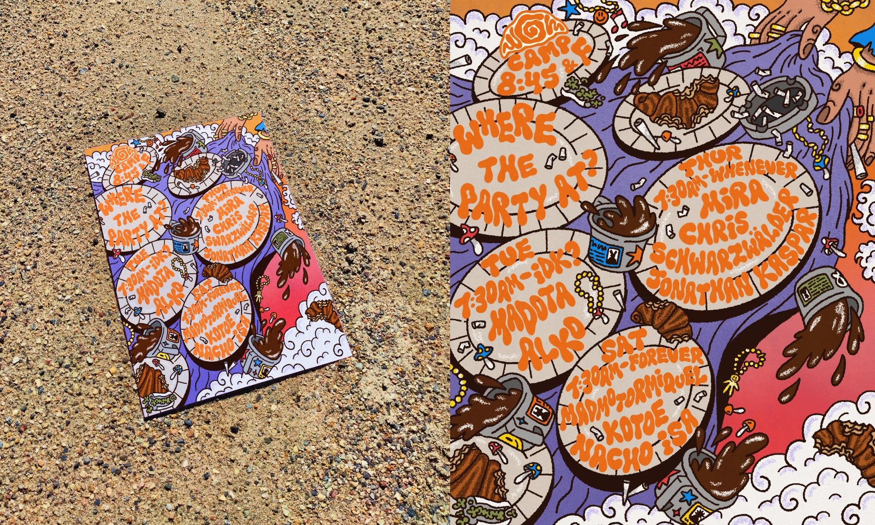
This is an illustrated brand identity for G Camp - a nonprofit Burning Man collective self-described as the official coffee & croissant house music club.
(2. )
Task
Create a brand identity for G Camp - a nonprofit Burning Man collective self-described as the official coffee & croissant house music club.
(3. )
vision
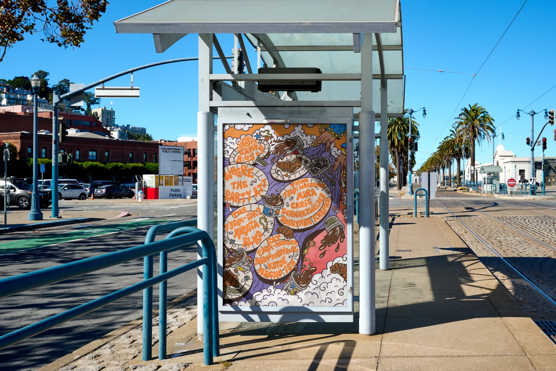
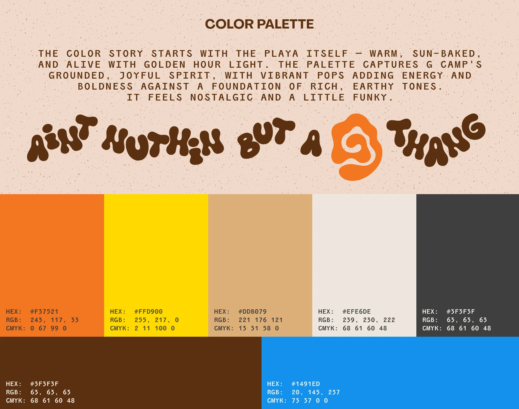
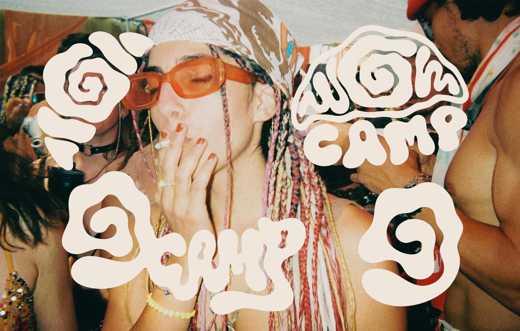
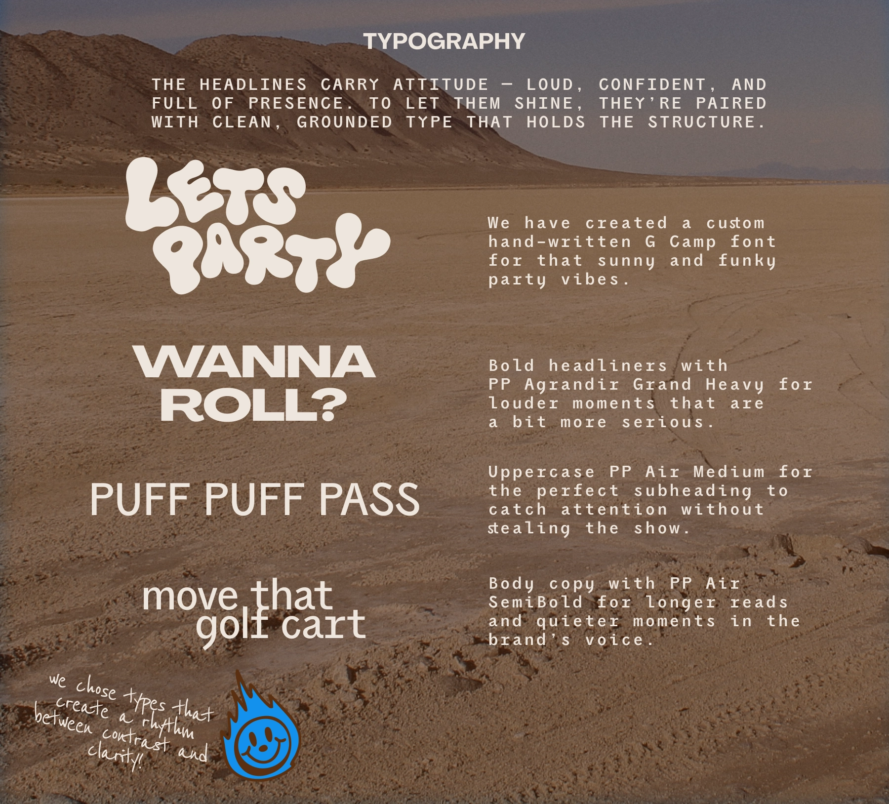
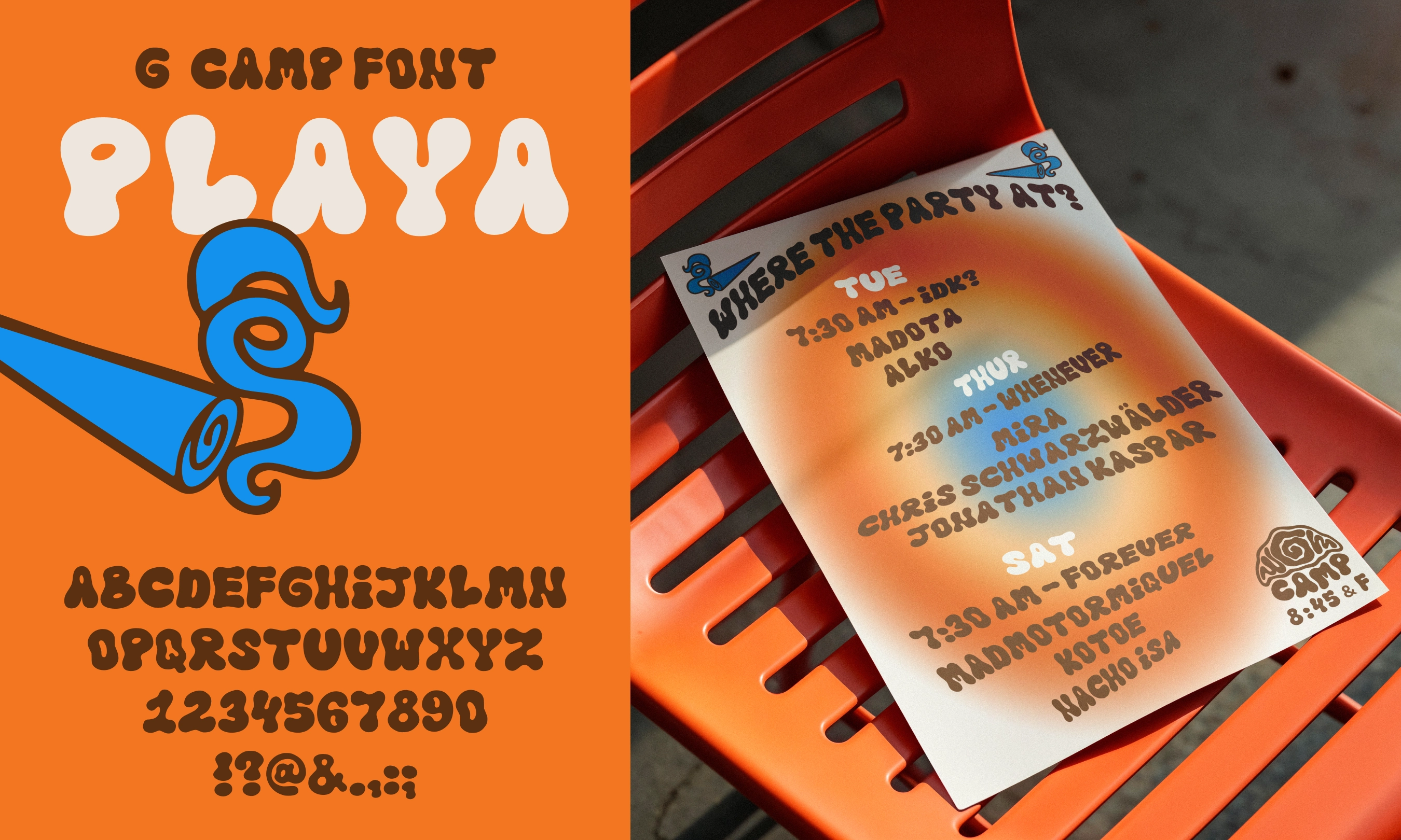
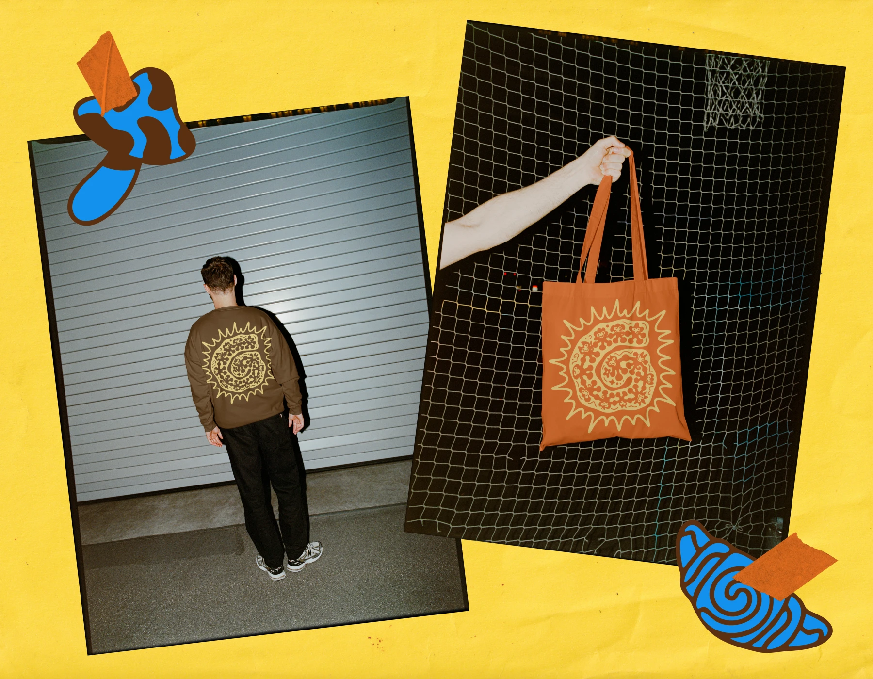
Its DIY spirit comes through in a system that pairs playful illustrations, warm playa-inspired palette, and expressive typography for a memorable, inviting experience across print, merch, and digital
(4. )
Solution
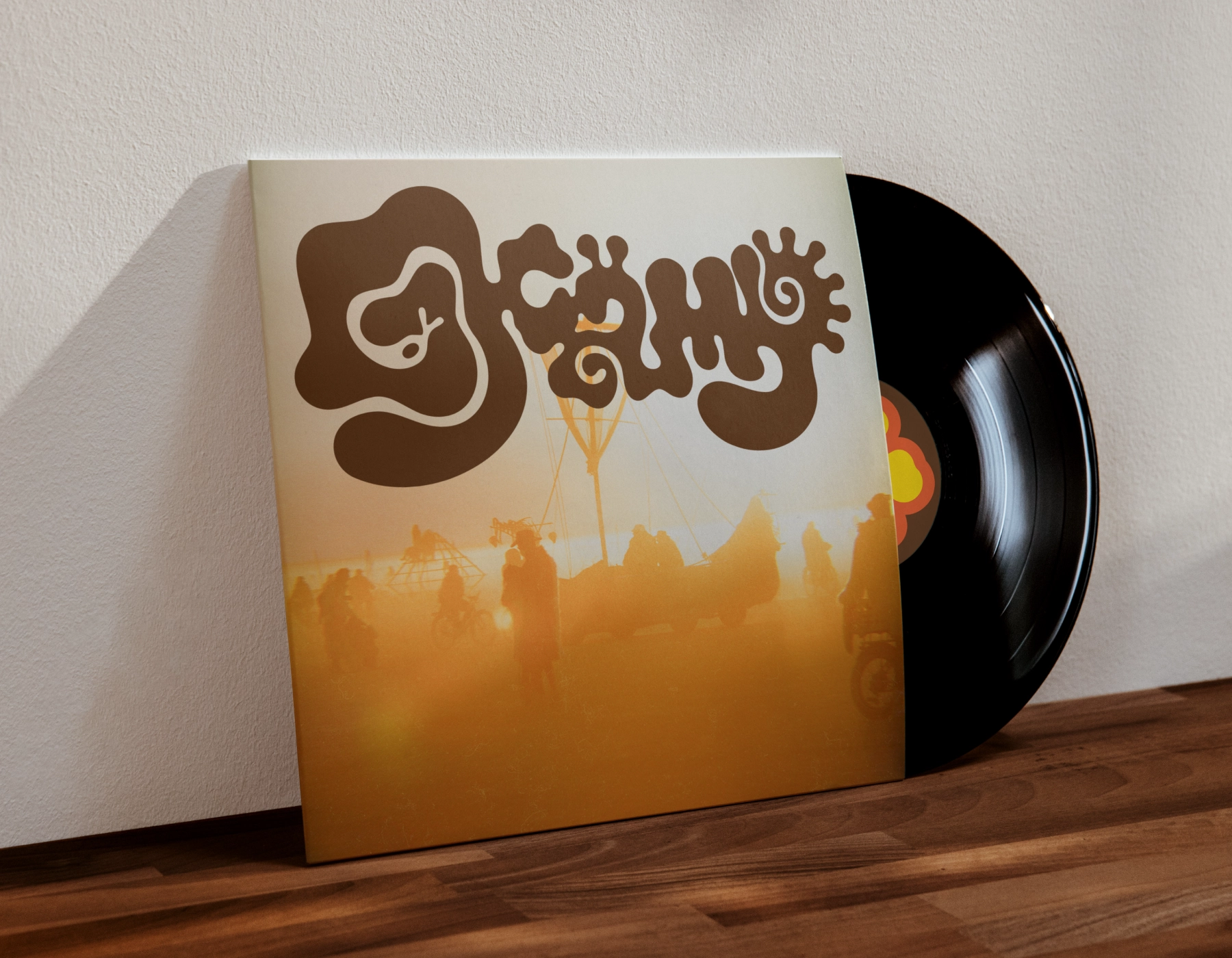
The result is a visual identity that mirrors the moment: warm, unpretentious, and built for the right people.

